It feels like the world has suddenly paused and started to notice things that are small. So small that our eyes do not see them… but we are aware and have a sense that they are there.
Read MoreCovid Colour Challenge. sureness, brightness and depth.
The Beauty Of Burnt Sienna and It's Earthly Power
“Every pigment has a peculiar nature as regards to its effect on the eye; besides this it has its peculiar quality, requiring a corresponding technical method in its application” Goethe, Theory Of Colours
The beauty of burnt sienna and its earthly power. Observing it's sureness, brightness and depth. A latent colour Burnt Sienna PR101 a transparent synthetic i...
As part of my PhD research writing, Ive been re-visiting burnt sienna Pigment Red 101 of late. I know this colour well, or should I say, I’ve worked with this colour for forty years and I’m still learning from it. Burnt Sienna has played an integral role in my paintings, particularly as an underlying warm ground colour but also as a glaze that can unify a painting with the sheerest of veils.
The colour named, Burnt Sienna, can have different visual appearances and working properties. I am working with Winsor & Newton Professional Watercolour, the Burnt Sienna and it is classified as Pigment Red 101. This colour is identified as an earth replacement using a transparent synthetic iron oxide with a lightfastness rating of 1 and a AA permanence rating.
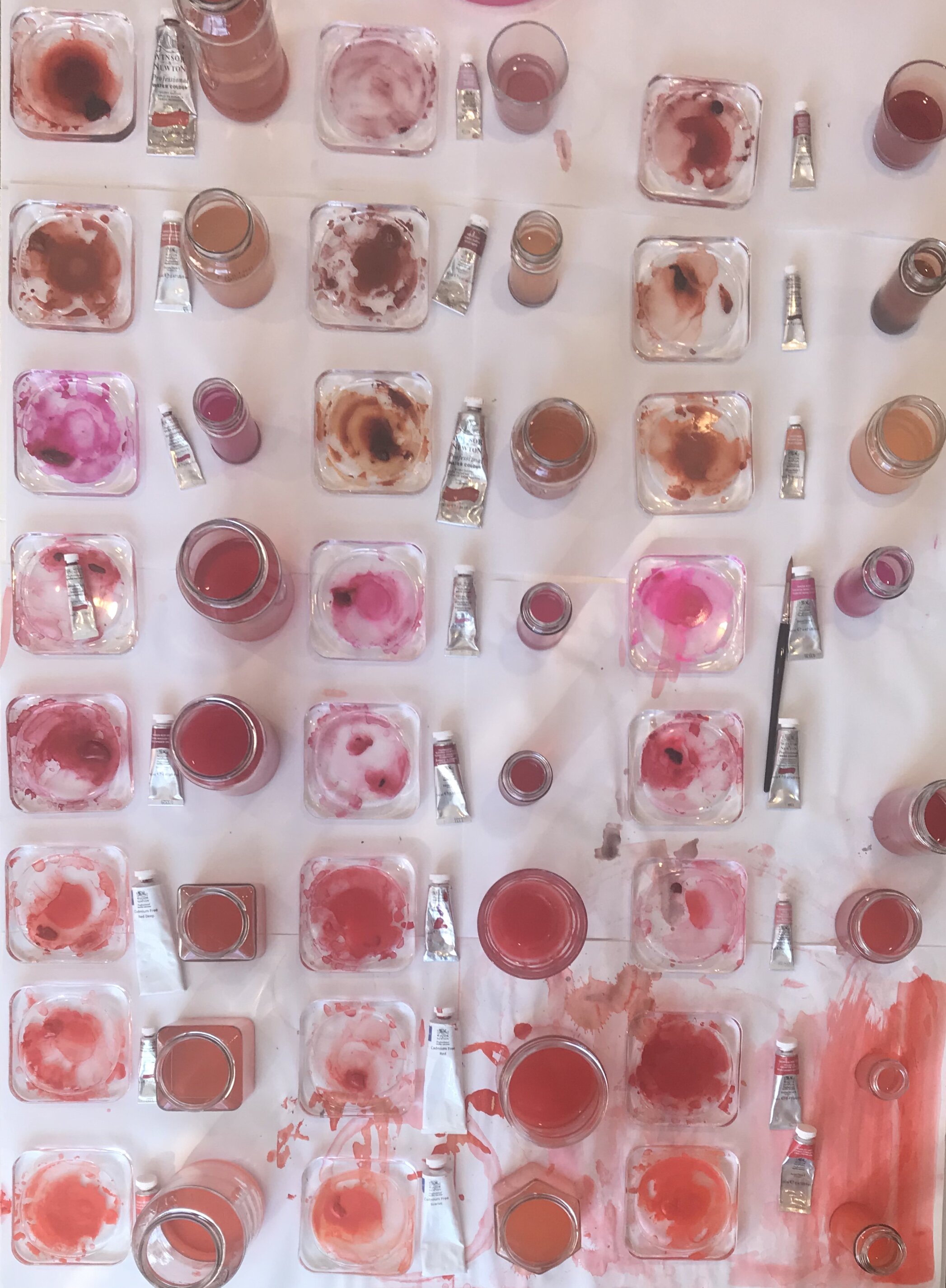
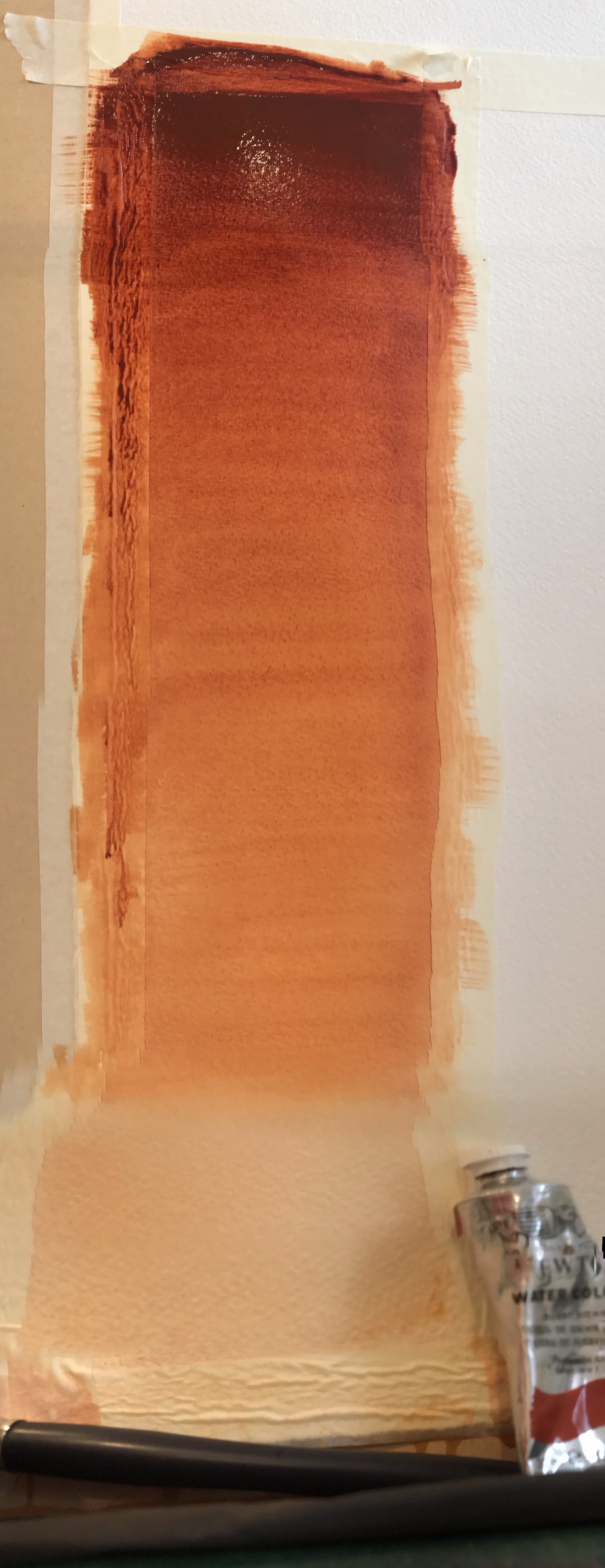
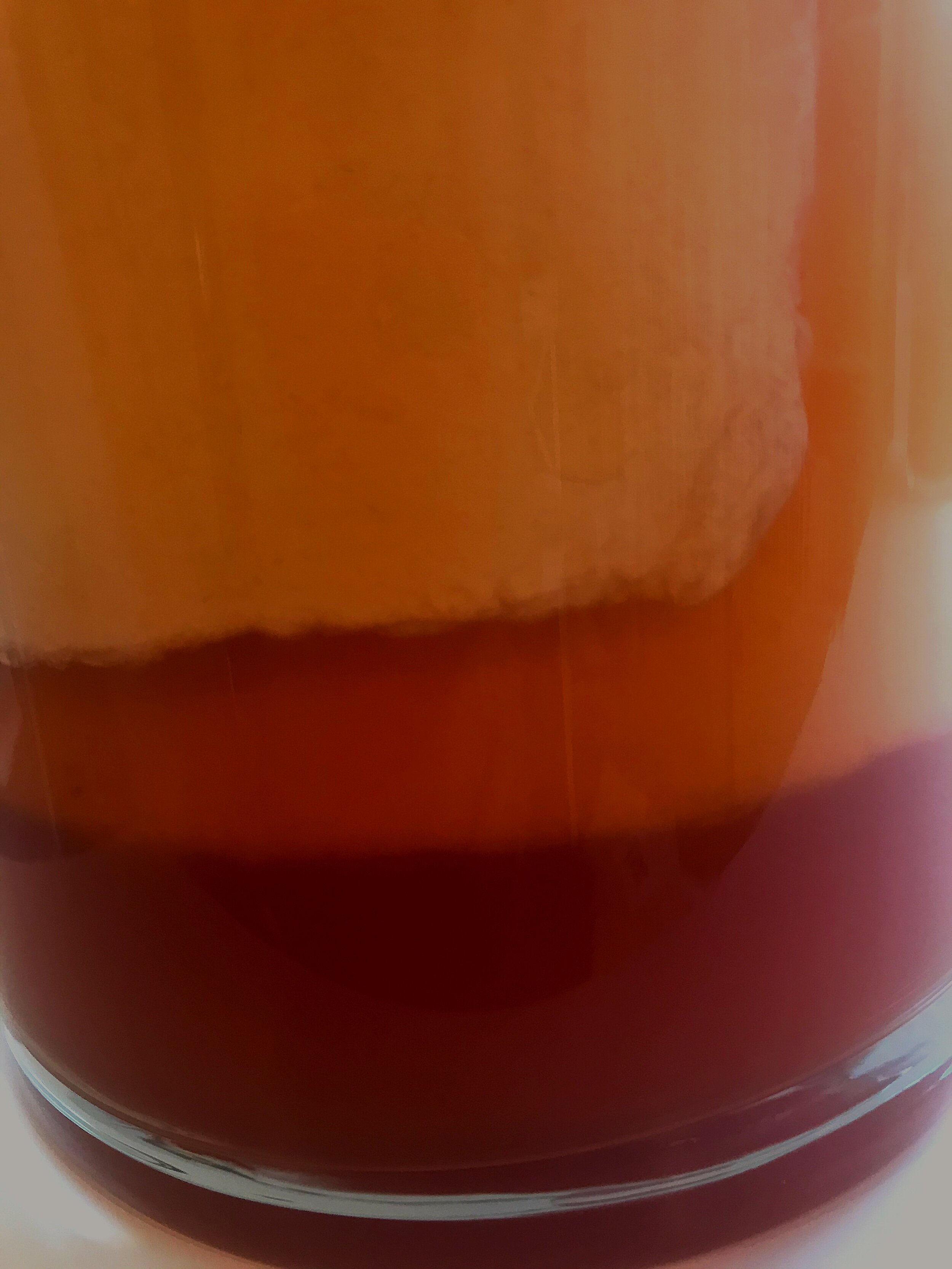
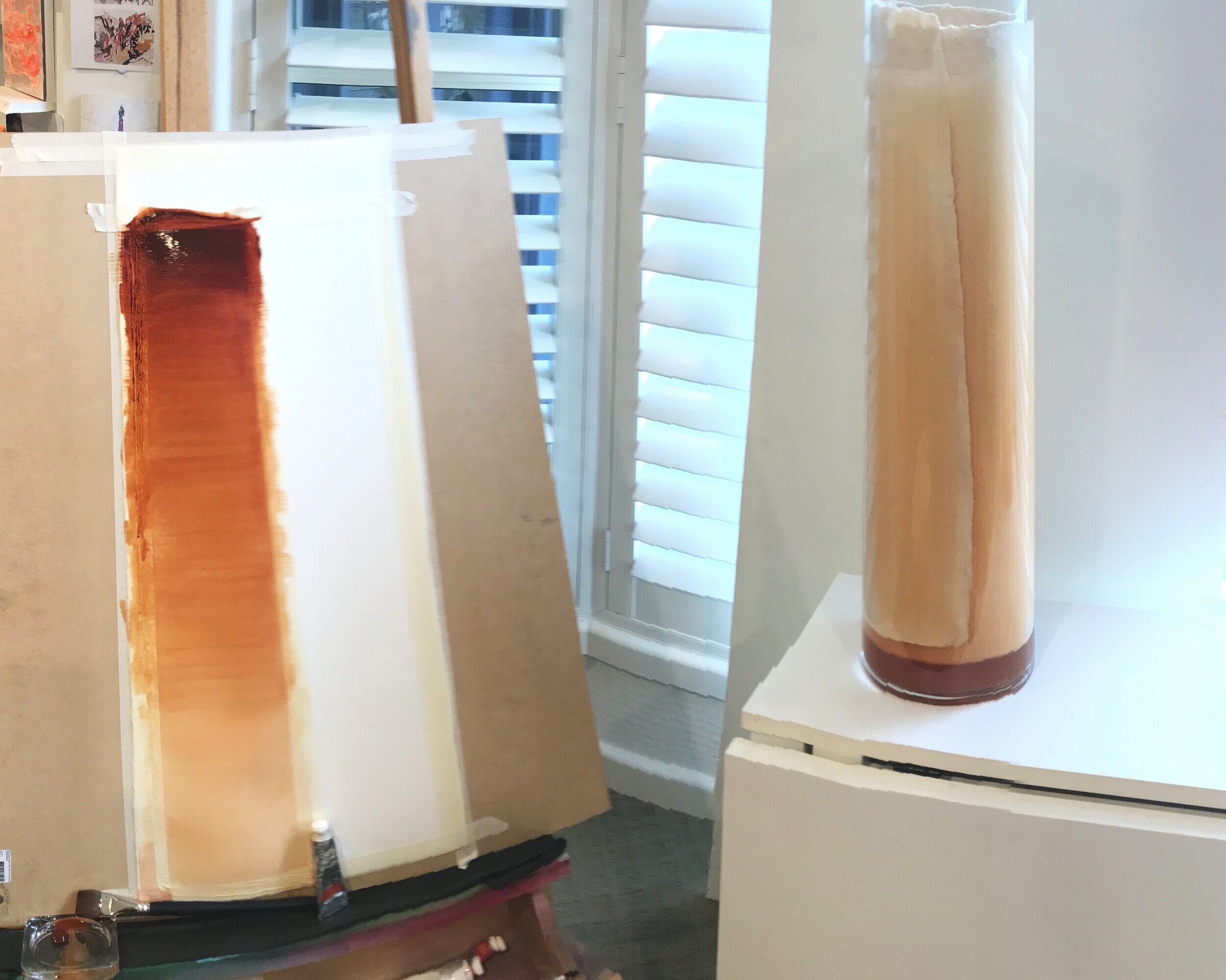
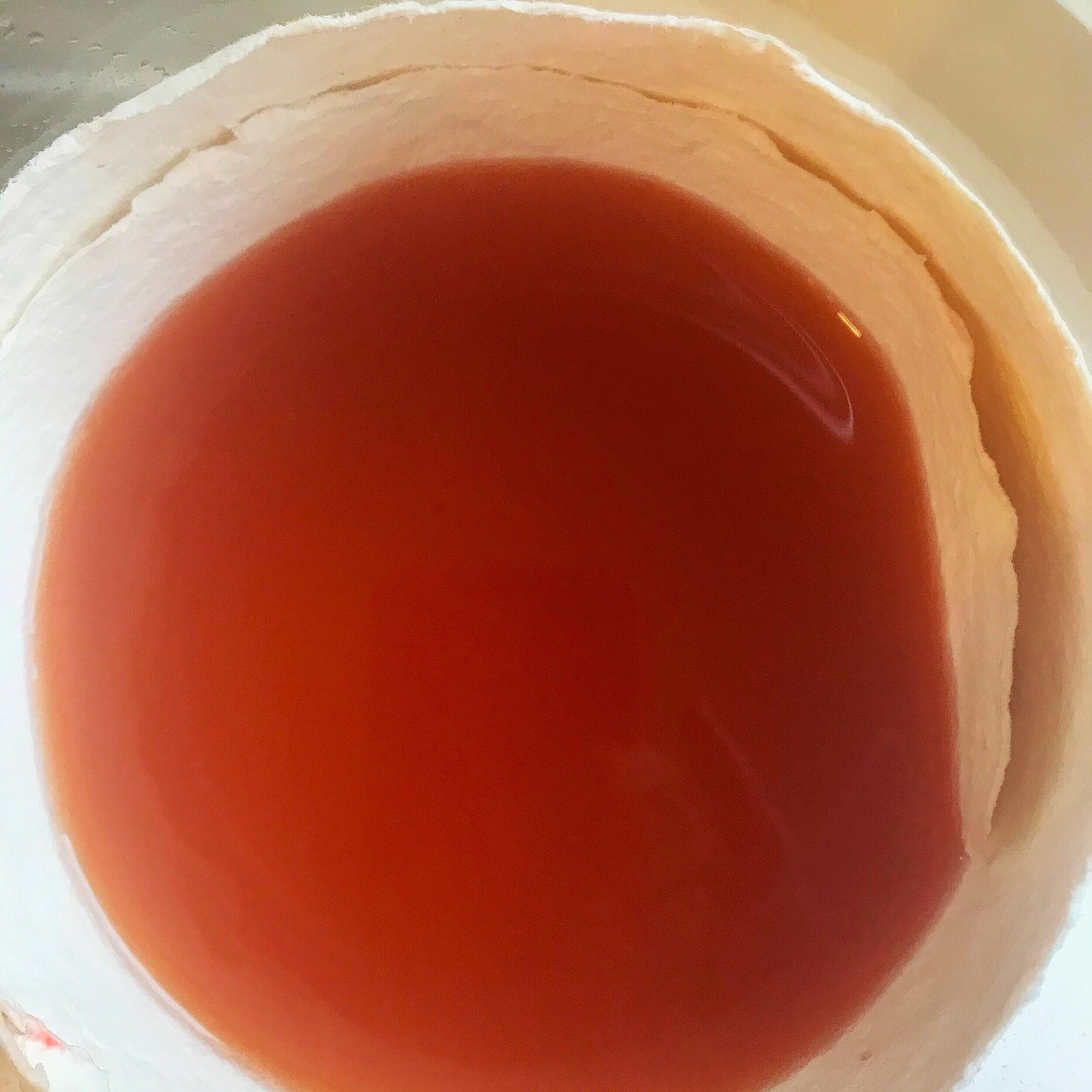
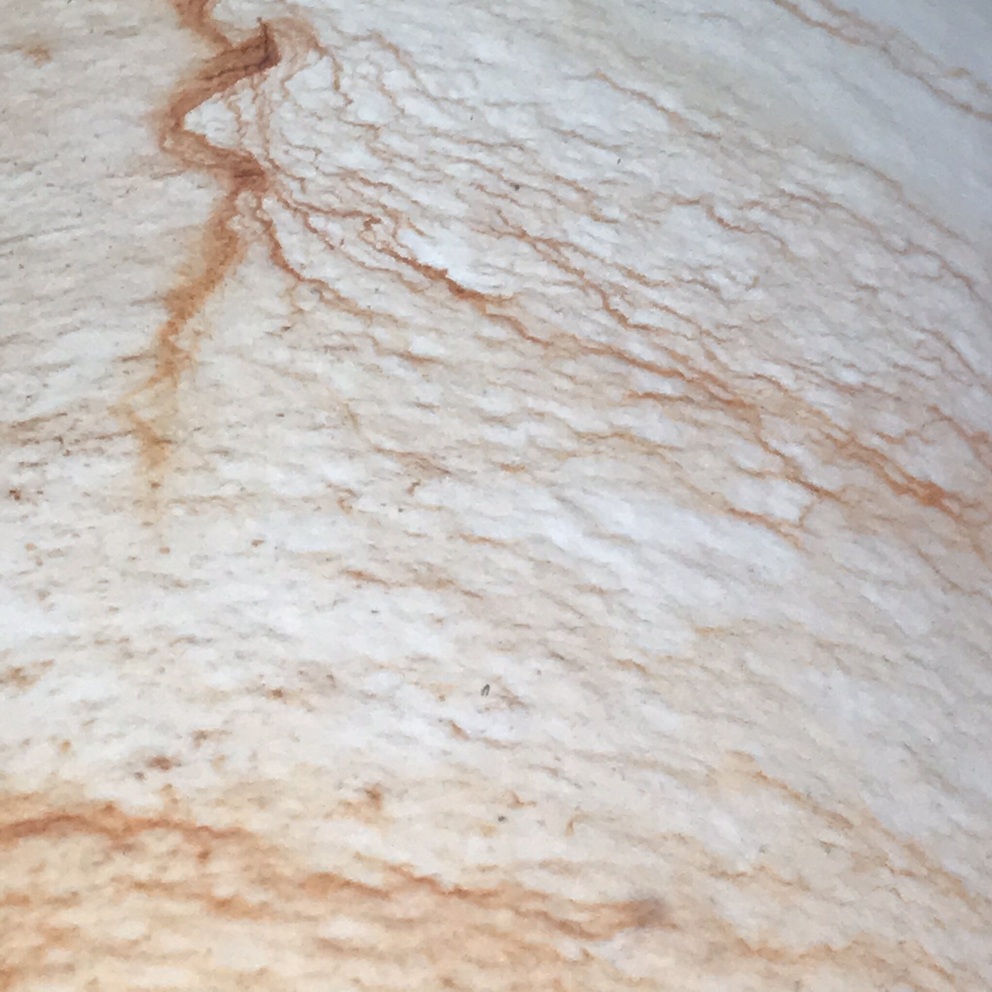
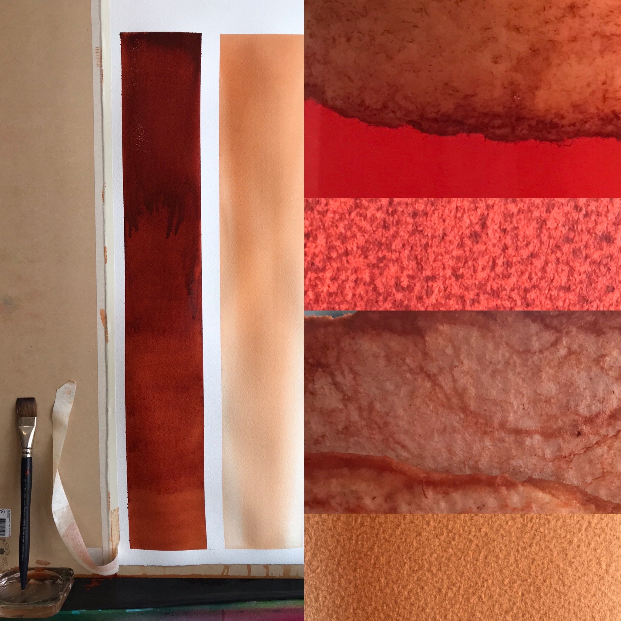
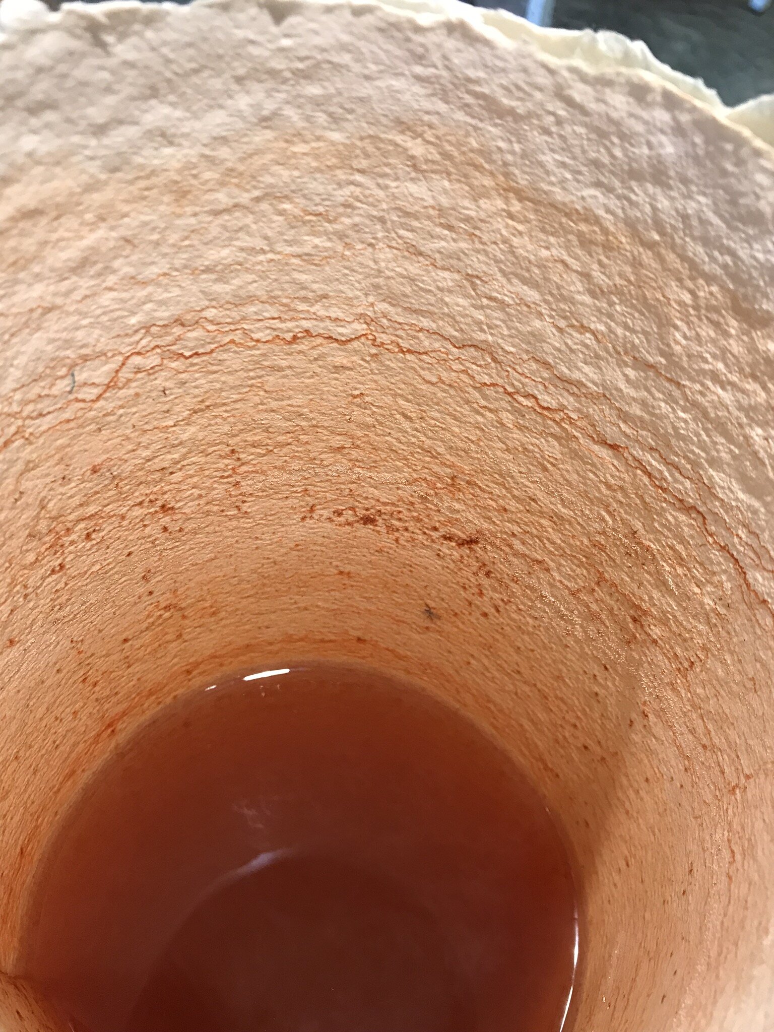
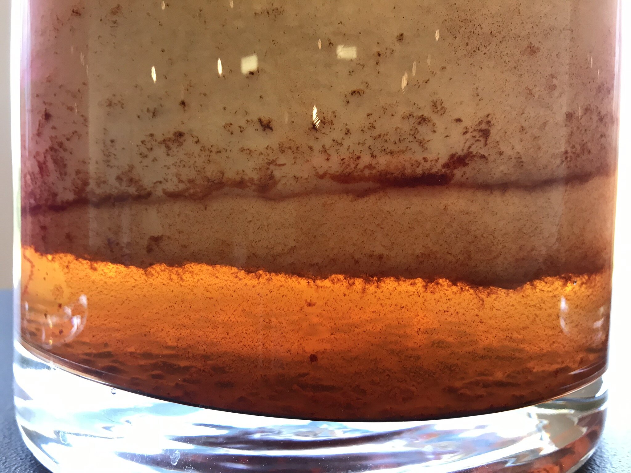
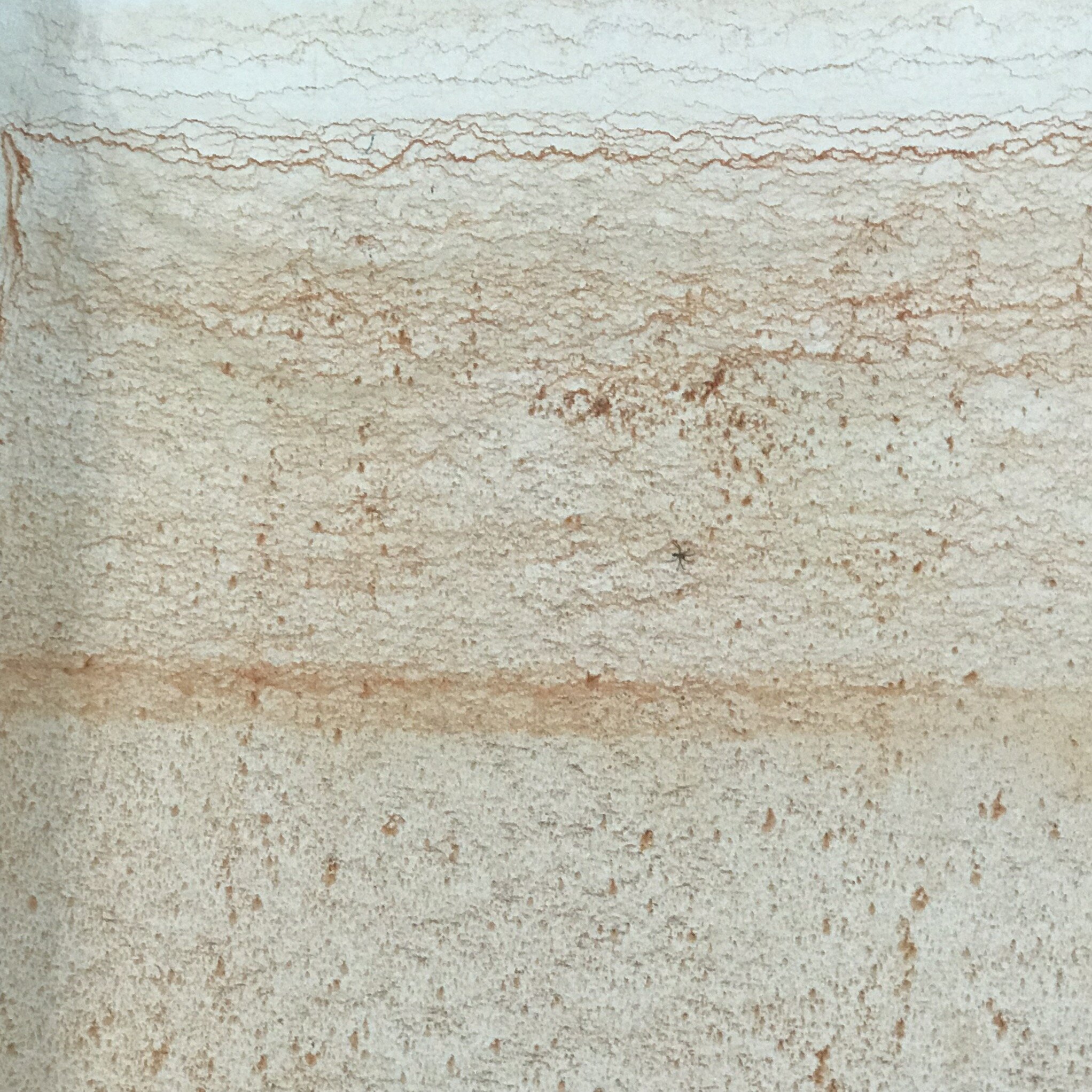
When I presented Gol Gol Layer Colour Observation #5 and #6 at Hazelhurst Regional Gallery, I included burnt sienna as part of the installation, as it is classified as a red pigment and its beauty can be seen in the Gol Gol Layer at Lake Mungo. The paper that was revealed after 2000 hours was much gentler in its saturation than I expected and the undertone of the wet colour in the glass vessel was closer to yellow than red. As seen in the video and images (below), I am repeating the study with Burnt Sienna for closer observation.
I have been working with Winsor & Newton Professional Watercolour Burnt Sienna since I received my first paint box when I was 11 years old. Burnt Sienna, in 1979, was a natural pigment that possessed the subtle qualities of transparency for glazing and mixing but in 1988, Winsor & Newton colourmakers could no longer expect the same qualities from the naturally sourced pigment and the introduction of a synthetic earth replacement became what I know is Burnt Sienna today.
Whilst conducting an acrylic colour comparative study in 2005 (where I used Burnt Sienna as a sample colour across five different colourmakers) I became unaware of how my understanding of the inherent qualities of the pigment, Burnt Sienna, was not a generic expectation for all Burnt Siennas. All its expected and inherent beauty of colour: its brilliance; sureness; depth and transparency; that I love to play with, were heavier, sitting with a more matt finish on the painting surface, and the colour mixing outcome provided me with a very different dark when mixing with french ultramarine. It is not that these Burnt Siennas are not good… but they are different, and their difference brings about an entirely different outcome.
So I could get trapped considering these behavioural differences across colourmakers and ponder the historical changes to the colour, but all of this seems inconsequential when I am standing in the studio, have the tube in my hands and I’m about to squeeze out a colour.
The 19th Century British colourmaker, George Field wrote,
… those pigments are most beautiful which possess the most colour, whether they be light or dark, opaque or transparent, bright or subdued. There are some which exhibit all their colour at a glance: there are others that the more they are looked into the more colour they are found to have - containing, as they do, an amount of latent colour.
So I am now observing more closely, this red called Burnt Sienna to know more about its’ beauty: sureness; brilliance and depth….its earthly power.
Keeping It's Place
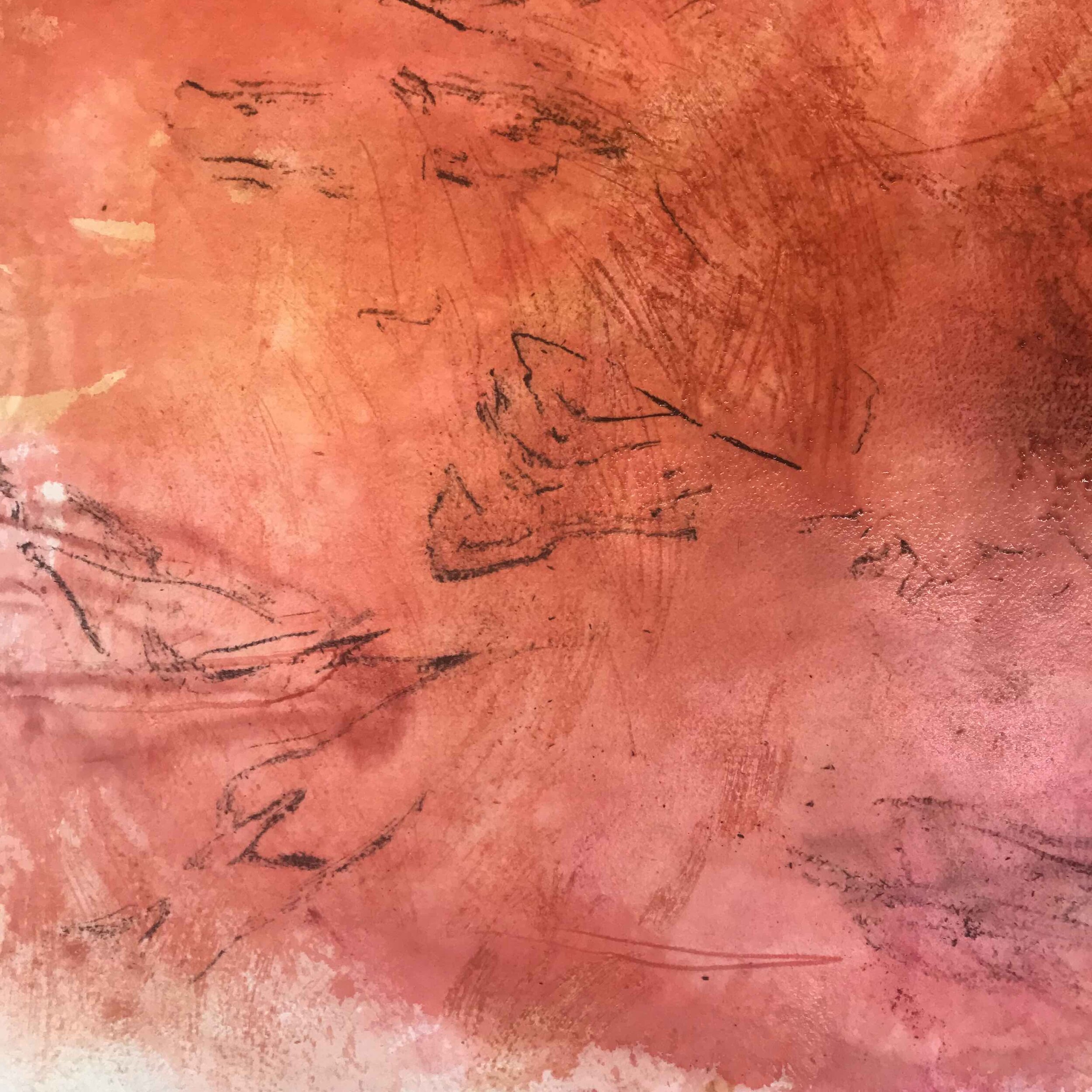
Im in my UNSW Art & Design studio space today and whilst people are slow to return from the summer break, Ive seized the opportunity to spread out a bit and review a work that I started out at Lake Mungo in May last year. Initially, I wanted to have the work complete in situ over a number of visits…but this morning I felt differently about a huge roll of paper and the charcoal remnants next to my desk. I could smell Mungo. I remembered a place.
I regularly get asked and to be honest I also wonder why I study this colour in particular… some days I know and I can see the personal connections and other days I’m just baffled why I would bother, but I keep coming back to my connection of colour and country…PLACE
layers of earthly redness. a work in progress
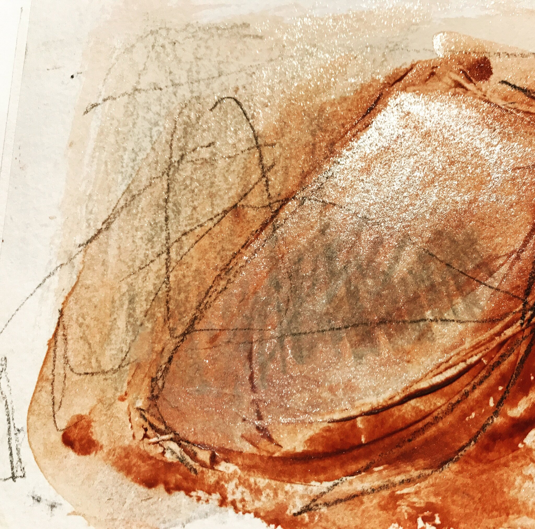
So I saturated the whole sheet which is about 1100cm squared and selected three earth reds; Burnt Sienna, Venetian Red and Perylene Maroon of Winsor & Newton Professional Water Colours and went to town with it!
I could feel the scars of invisible drawings done by sharp stones and sticks from my first time with this paper whilst working at Lake Mungo, NSW National Park. I could feel small grains of sand and clay. A memory of place.
The paper is heavyweight cotton but it becomes soft when its saturated with water and the red pigments of Burnt Sienna and Perylene Maroon soon stain through the surface and embed themselves deep in its layers. I did not used the Venetian Red. It is a beautiful red with a density and weight that is probably closest visually to the red of the pockets of dense red clay at Mungo but I felt that it was too soon introduce her to the work. The Burnt Sienna and Perylene Maroon need to have some time on their own. I want to see what they do first.
Ironically, I have called this post keeping their place, which is a reference to the nineteenth century colourmaker, George Field and his identification and advocacy of the inherent qualities of physical colour used by artists, one of these qualities being…keeping their place. The quality of a coloured pigment is determined by its dispersion with a vehicle (which in the case of my use of watercolour in the studio today is gum arabic) to maintain its stability and strength.
For these reds paints to feel like Mungo they almost need to be subjected to the elements as well…..water, wind, air, earth and time. Every particle needs to find its own place.
Im in the studio at unsw art & design working on a chapter of my thesis - the earthly reds. I have to make in order to be able to write...practice led resear...
Gol Gol Layer Colour Observation 5 - lakebed exhibition @ concordia gallery →
Gol Gol layer colour observation 5 at 1000 hours.
I documented the settling of pigment in each of the 25 vessels of colour. Distinct differences were noted and the pigments attachment to the paper surface as the action of evaporation occurred left extraordinary marks that left a visual imprint of the character of each red pigment.
Read Morethe earthly reds of our country
late afternoon walk along the Gol Gol layer at Mungo.
Read More

